A Q&A with Kate Troyer, Creative Director of Artscape
Color shapes how we feel, live, and move through our spaces. At Artscape, each design begins with mood and meaning, with colors that tell real stories or stir up joy. In this second volume of our Rooted in Color series, we dive into the interweave of intuition, light, and nature with Kate Troyer, exploring how palettes evolve from Pacific Northwest inspiration into Artscape designs.

Q. When you begin a new design, do you start with color, pattern, or mood?
I usually start with the subject matter and the mood I want to create. The color comes after, and is shaped by how those two interact, whether the interpretation is literal or abstract. It all starts with feeling first.
Q. How would you describe your relationship with color?
Somewhere between intuitive and deliberate. I love creating moods that surprise — sometimes the best feeling comes from an unexpected color relationship. I try not to overthink it; it’s part instinct, part intention.
Q. Is there a palette you find yourself returning to?
I’m drawn to colors that have depth and richness, but I also can’t resist a pop, orange, pink, something playful. That surprise element brings warmth and personality, both in design and in life.
Q. How does light, especially in the Pacific Northwest, influence your palette?
Light here is poetic. I think of biking through tree tunnels where sunlight flickers through the canopy, or standing on Mount Hood after a snowfall where everything is heavy and bright. There’s this duality: soft but strong, bright but grounded. That balance shows up again and again in my approach to color.
Q. How do the changing seasons guide your color choices?
Fall and winter call for warmth and texture, colors that feel cozy, like a blanket. Then summer calls for brightness, color that winks, says hello. But I always try to design for longevity, something that feels good all year round, wherever someone lives.
Q. How do you refine your palettes as you design?
I start with a set of colors, but once they sit together, the relationships shift. Sometimes you need to warm a tone, cool it slightly, or replace it entirely. It’s like tuning an instrument until the sound feels balanced.

Q. How does collaboration shape your color decisions?
When working with other artists, it’s important to honor their instincts, color is tied to their voice. Collaboration becomes a conversation, finding where our visions overlap while keeping the integrity of their work intact.
Q. What do you hope people feel when they live with your designs?
Connection. I want our designs to feel like a reflection of the person who chose them, that sense of belonging, of home. Whether it’s calm, cozy, or joyful, I hope our wallpapers and window films give them the feeling they need most in their space.
Q. If your personal palette had a name, what would it be?
Conversational. Color should invite curiosity. It can start a dialogue, free up a nice memory, or just make you pause and smile.
This Week’s Color Stories
Week 3 — Fungi Neutrals
Palette: mushroom, taupe, clay, stone
Mood: timeless, versatile, textural
Inspiration: the soft gills and sheen of oyster mushrooms

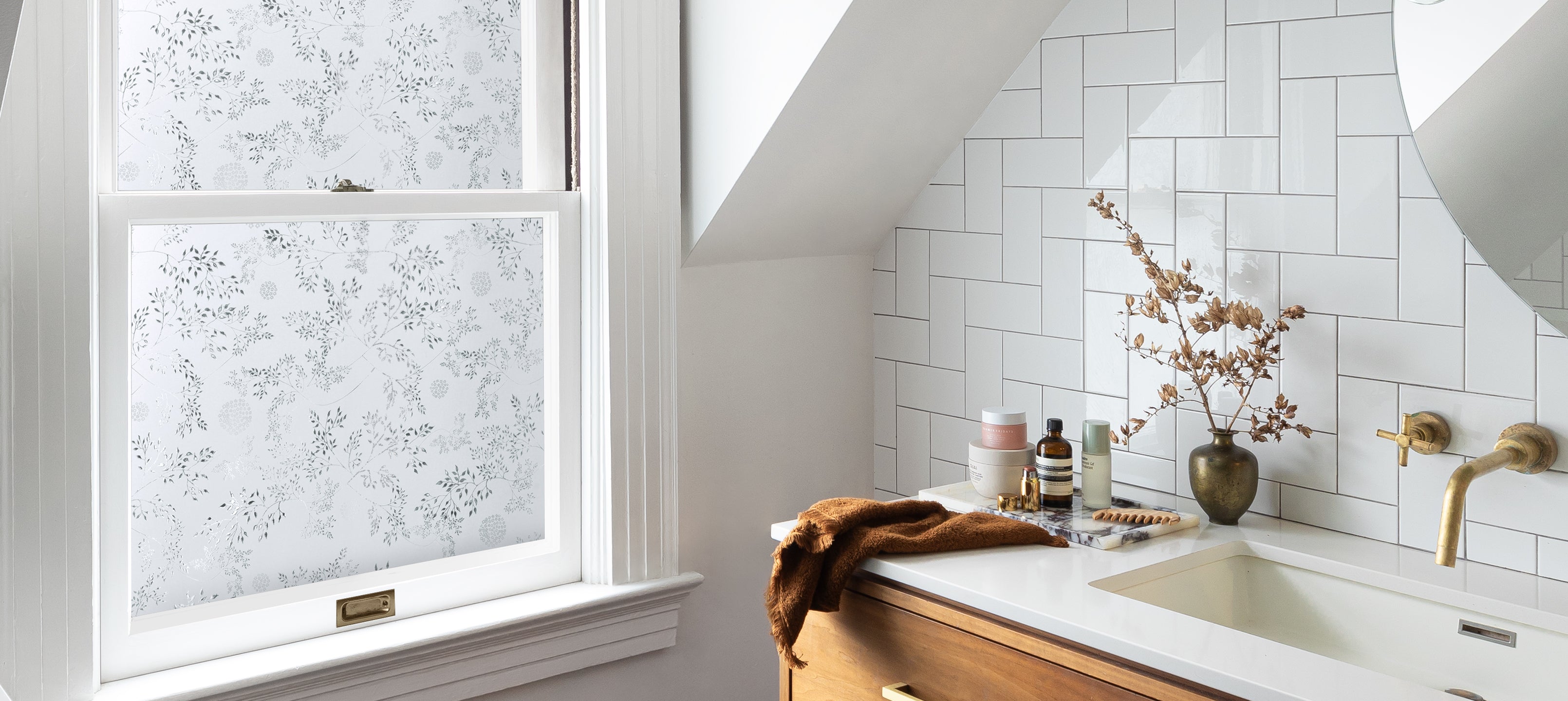
Earthy and grounded, Fungi Neutrals offer a foundation that feels organic and enduring hues that pair easily with any palette. Like a favorite linen or a well-traveled path, they’re subtle yet full of texture.
Where these tones show up:
- Window Film (left): Clouds — a soft, airy pattern that soothes.
- Wallpaper (right): Sedona — sun-washed tones that bring a soft, mineral warmth to walls.

Week 4 — Berry Pigments
Palette: mulberry, plum, blackberry
Mood: rich, expressive, soft contrast
Inspiration: the dusky tones of huckleberry at dusk

Berry Pigments deepen the palette, lush, emotive colors that bring vibrancy and depth without overwhelming a space. They’re sophisticated yet bold, a perfect companion to neutrals or wood tones.
Where these colors reveal themselves:
- Window Film (right): Larkspur — inspired by garden flowers: deep purple lobelia, soft pink verbena, and violet hydrangeas.
- Wallpaper (left): Charlotte — a botanical, deco-inspired print that combines romance and rhythm.

Looking Ahead
As Artscape’s color story unfolds, these palettes, from the grounded calm of Fungi Neutrals to the invigorating tones of Berry Pigments, move us toward openness and play. Our approach to color is evolving. It's less restrained, more exploratory, and always rooted in how it makes us feel.