As winter settles in, we’re turning toward palettes that offer clarity, calm, and refinement. This chapter of our Color Story explores two palettes, Ink & Spruce and Lichen & Mineral, each designed to bring stillness into your spaces, to support your attention rather than compete for it.
Week 5 — Ink & Spruce
Palette: inky blue, spruce, charcoal navy
Mood: focused, calm, thoughtful
Inspiration: blue spruce needles

Ink & Spruce is a palette built for presence. These organic cool tones anchor a room without weighing it down. The hues are reminiscent of winter evergreens and inky berries, structured yet soft, saturated yet serene.
Where it shines:
- Home offices, reading corners, studio spaces
- Rooms where you yearn for focus without harshness
- Interiors craving sophistication through color rather than ornamentation
Featured Designs:
Savannah Window Film diffuses glare with fluid texture, ideal for balancing privacy with consistent natural light. Paired with Meadow Wallpaper, a hand-drawn botanical, the combination feels grounded and contemplative.

Week 6 — Lichen & Mineral
Palette: mist grey, mineral blue, soft green
Mood: clean, airy, architectural
Inspiration: lichen covered stone
Lichen & Mineral offers a counterpoint: lightness. Instead of grounding with depth, this palette lifts, opening visual space and softening edges.

Where it shines:
- Kitchens, bathrooms, and transitional spaces
- Areas that benefit from clarity and openness
- Minimalist rooms needing softness without warmth
Featured Designs:
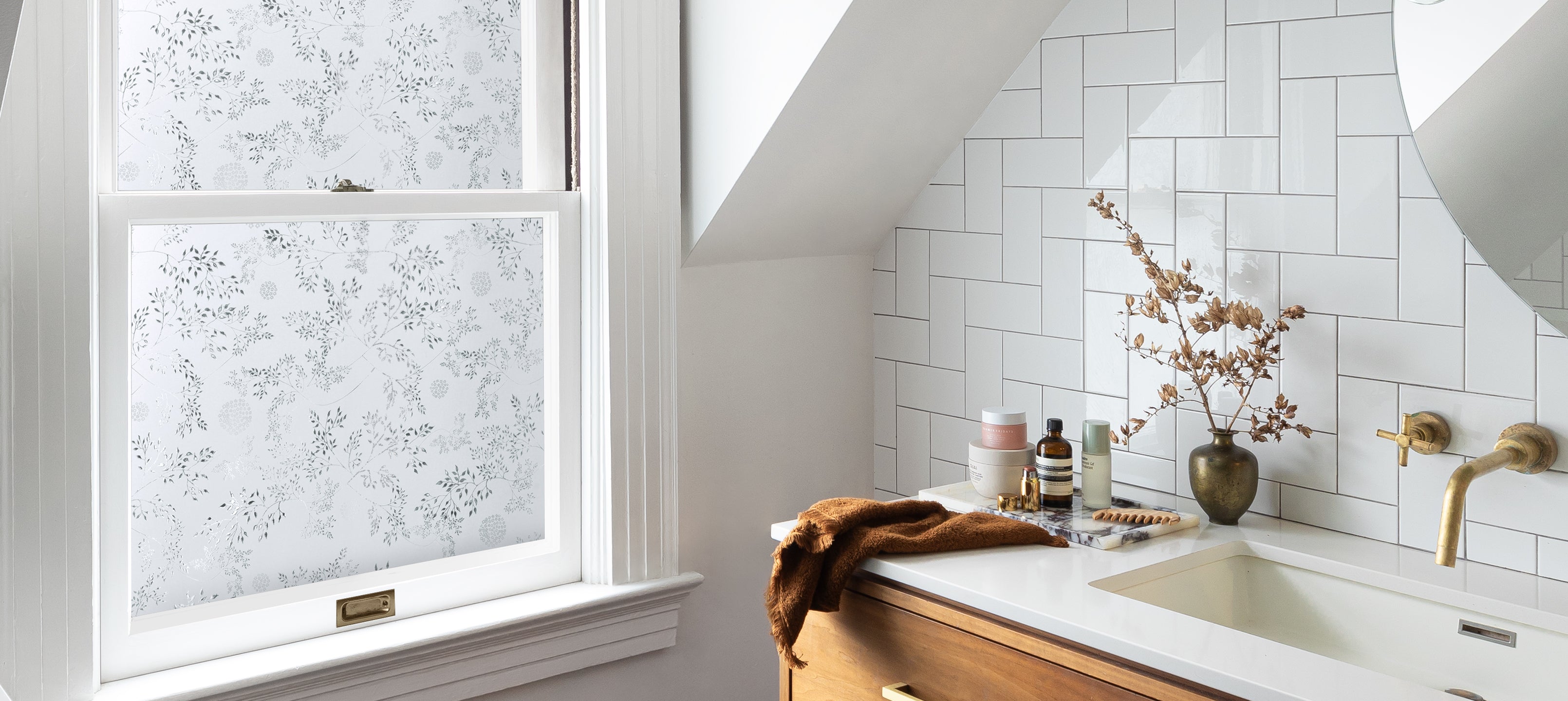
Jasmine Window Film lends a privacy layer with intricate petal details that play beautifully with daylight. Paired with Posies Wallpaper, a tender floral pattern, the palette becomes fresh and full of whimsy.

Together in the Home
Ink & Spruce and Lichen & Mineral work well side-by-side. Use the deeper blues to define focus-driven areas and the lighter tones to expand the spaces where you want breath and ease. Both palettes offer an invitation to slow down, look closely, and let color guide the mood of your home.