Color is where every design begins for us. It’s the foundation of each window film, wallpaper, and surface we create. It's the spark that shapes texture, pattern, and light. Over the next eight weeks, we’re pulling back the curtain and sharing the tones that inspire us, one palette at a time.
Each palette has a mood, a story, and a sense of place, grounded in the Pacific Northwest and shaped by the way we live and feel at home.
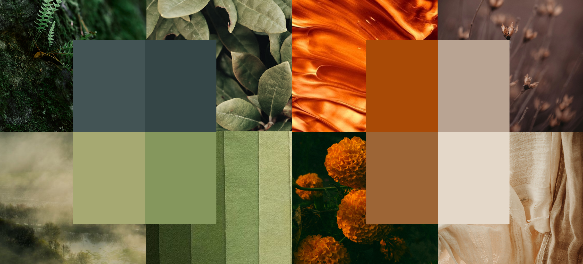
For our first chapter, we’re starting warm and inviting, then moving into calm, nature-leaning greens.
Amber & Alder
Palette: amber, honey, warm umber
Mood: warm, grounded, studio-cozy
Subtle Inspiration: Alder wood tone

Our Amber & Alder palette feels like sunlight catching the edge of a studio table, golden, familiar, soft yet radiant. These tones invite warmth into interiors without overpowering them, adding a gentle depth that feels both crafted and lived in.
We see this palette reflected in our Sunset window film, where soft gradients of amber and gold transform natural light into a warm, shifting glow. Paired with our Presley wallpaper, the effect becomes tactile and expressive, the perfect balance of warmth and subtle movement. Together, they create spaces that feel gathered-in and welcoming.
Sunset
|
Presley
|


Soft Evergreen
Palette: muted greens, sage, olive
Mood: calm, natural, balanced
Subtle Inspiration: Fern + salal

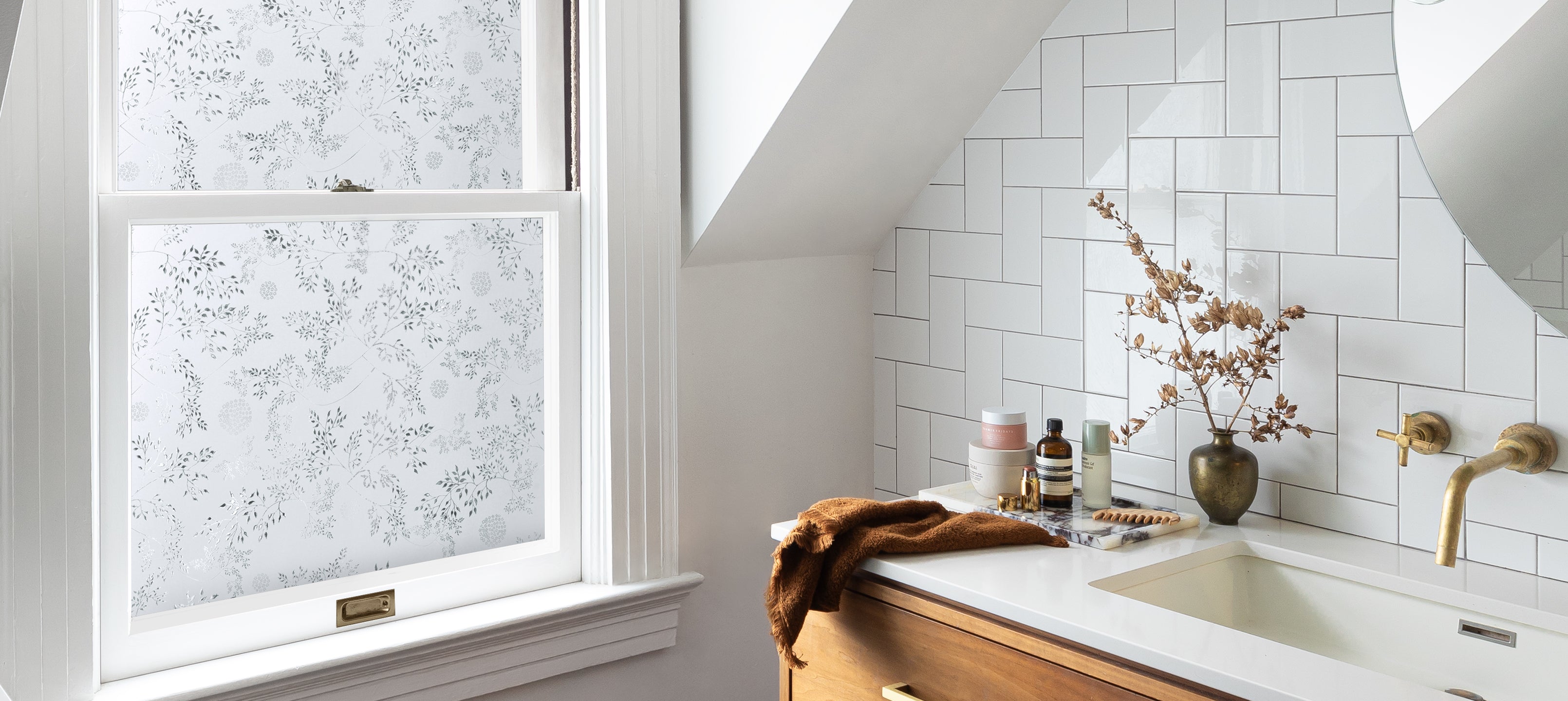
Soft Evergreen moves us into a gentler space, one that feels connected to nature and refined. These greens bring calm and clarity, an exhale for your home.
Our Star Magnolia window film mirrors that feeling: delicate, inspiriting, and botanical. When paired with the Florence wallpaper, the combination offers a modern take on natural pattern one that is timeless, adaptable, and cozy.
This palette speaks to stillness and simplicity, the kind of spaces that invite you to slow down and breathe.
Star Magnolia
|
Florence
|


A Study in Light and Place
As we move through this series, our palettes will evolve with the season, from fall into winter, shifting from grounded warmth to brighter, more luminous tones. Each pairing is an exploration of how color interacts with pattern and transparency, how design lives within the light, and how place shapes perception.
Follow along as we continue to explore the colors that inspire us most.