As we close out our Color Story series, we land somewhere intentional and calm. These final palettes exhale colors that are grounded, refined, and holistically expressive.
This way of working is aligned with how Artscape designs come to life. As our in-house designer Christin Dunbar shares, color, pattern, and mood are never separate steps. They evolve together, guided by intuition and refinement.
“The pattern really comes first,” she explains. “Then it’s about how I want that pattern to feel. Color can completely shift a design from energetic to calming. There’s a little hierarchy, but ultimately, it all comes together.”
That ethos carries us through Weeks 7 and 8.
Week 7 — Coastal Evergreen
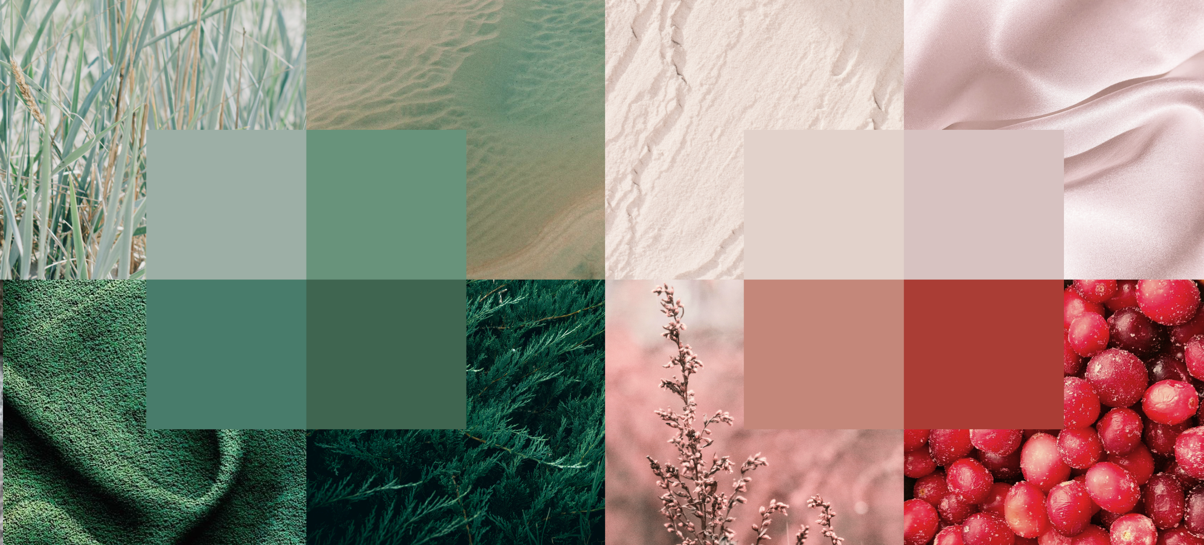
Palette: silver-sage, tonal green, tidal teal
Mood: fresh, modern, refined
Subtle inspiration: Shore pine hues
An elevated way to introduce color while staying calm and considered.

Coastal Evergreen is all about balance. These greens are tonal, layered, and intentional. They bring freshness without visual noise, offering clarity rather than intense contrast.
This palette reflects Christin’s affinity for ethereal, grounding color stories, those that feel airy, light, and lived-in.
“I always start with something calming,” she notes. “Dusty, light tones. Neutrals with just enough color to feel alive.”

Featured designs:
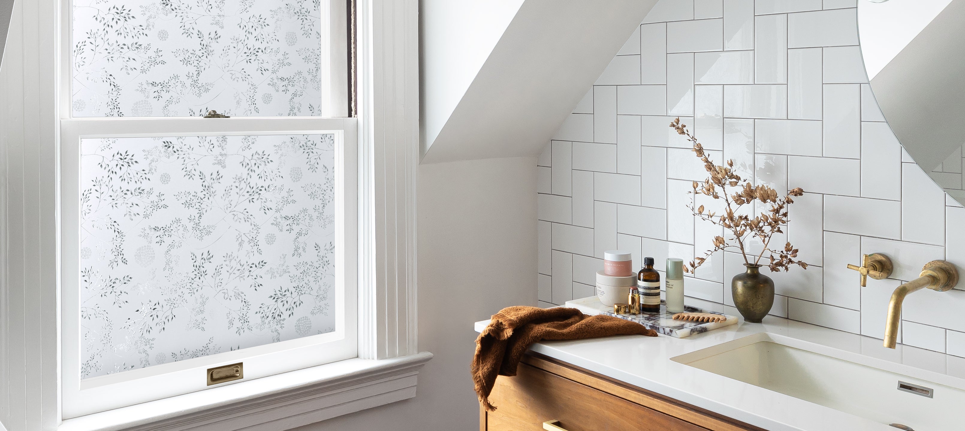
• Window Film: Winter Magnolia
• Wallpaper: Florence

Together, Winter Magnolia and Florence create spaces that feel connected and composed, ideal for rooms that want presence without intensity.
Week 8 — Winter Bloom
Palette: blush, warm pearl, soft neutral-rose
Mood: soft, uplifting, warm
Subtle inspiration: Nootka rose hips
A gentle, optimistic close to the year.

Winter Bloom is all about softness without sentimentality. These tones have a soothing glow, bringing warmth that feels natural and evergreen in seasonality, an invitation to slow the pace and soften the edges.
While Christin designs with timelessness in mind, she acknowledges that our relationship with color shifts as the year does.
“In the colder months, I’m drawn to warm, rich, natural hues. Not bright or sharp, just cozy and inviting.”

Featured designs:
• Window Film: Heritage
• Wallpaper: Somerset
Heritage and Somerset pair warmth with restraint, creating spaces that feel held and welcoming.

Designing with Intuition, Refinement, and Care
Across all of Artscape’s work, color is treated as an emotional tool versus a trend forecast. Christin’s process is intuitive and collaborative.
“It’s a lot of trial and error,” she says. “I ask how a palette makes people feel. Over time, that becomes the instinct you sense when something is strong in your gut.”
That sense of feeling is key. Color means different things to different people, and refinement often comes from small adjustments and conversations.
“A tiny edit can elevate the entire piece.”
A Feeling We Hope Lasts
When asked what she hopes people feel living with her work, Christin’s answer is simple:
“I want people to feel cozy. Calm. At home.”
That intention ties together this entire Color Story series. Whether it's through greens inspired by coastal evergreens or blush tones drawn from winter botanicals, these final palettes are about creating spaces that feel nurturing and optimistic.